
100 color combinations to influence your next design
Pairing the right colors together creates harmony in UI designs. Learn 100 color combinations for your next project and how Figma can help.
Skip to main content
Design basics
Experiment, refine, and apply color palettes in Figma.
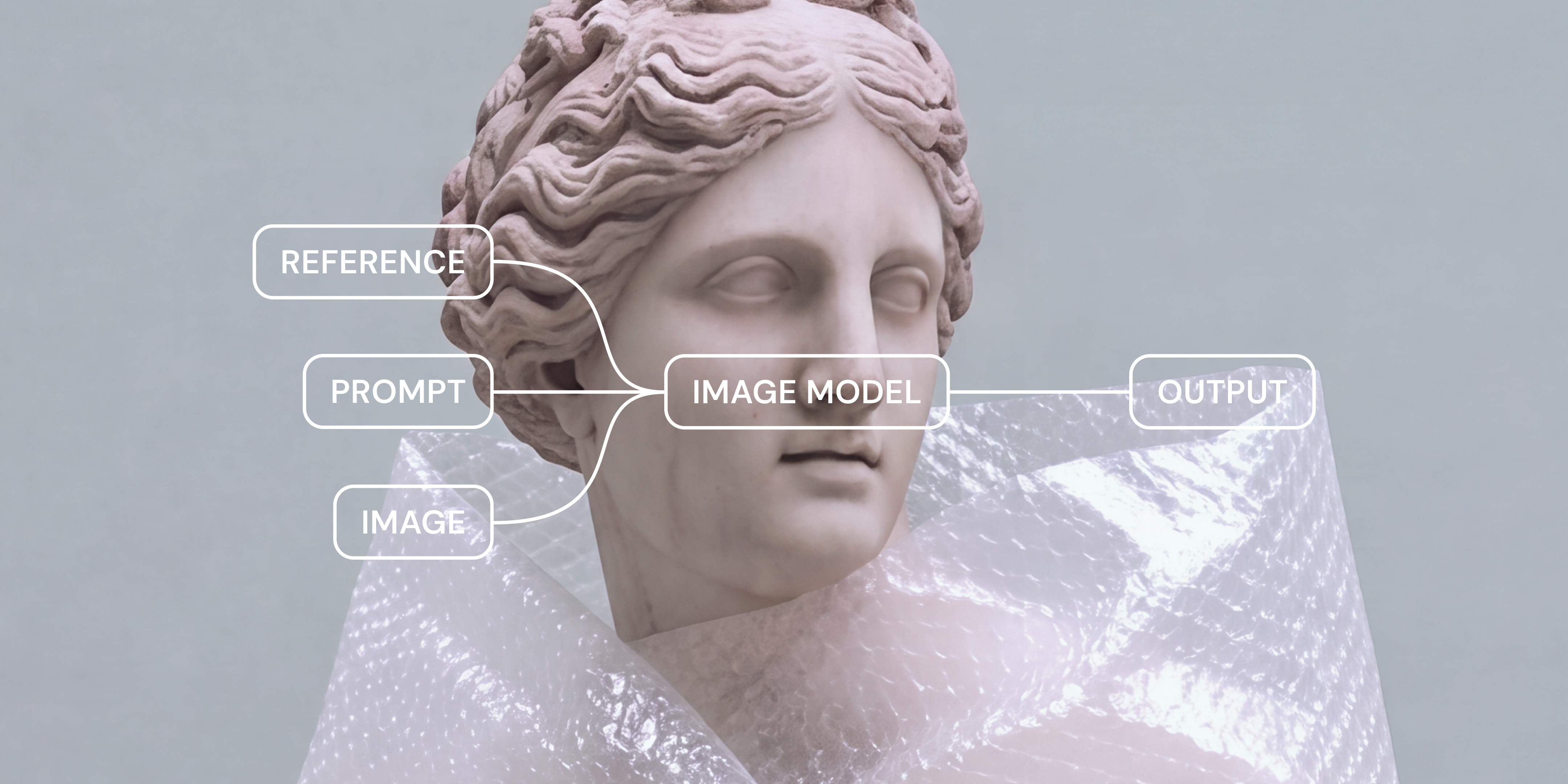
Most footage, photos, or exported design work looks technically fine but forgettable until someone gives them a point of view. Color grading takes footage or an image that’s already exposed and balanced correctly and gives it a specific mood, whether that’s the warm nostalgia of a travel brand or the cool tension of a horror movie trailer.
In filmmaking, color grading used to live almost entirely with film colorists, who sat in a suite with scopes and color wheels. Now the same principles show up in marketing photography, product demo videos, and social content—and, increasingly, in visuals that started out as an AI generation rather than a camera shot.
Matching a grade across a mix of AI-generated and captured images is a delicate phase of the modern video production process or photo workflow. That’s where Figma Weave comes in.
Read on to learn:
Color correction is the technical cleanup pass. It fixes problems like inconsistent exposure, inaccurate white balance, or shots pulled from different cameras that don’t quite match. Typically, the goal of this phase is neutrality and accuracy. You want your footage to look like what the camera or design tool actually captured, nothing more.
Color grading is the creative pass that comes after color correction. Once a shot is technically right, grading shapes how it feels. A working knowledge of color theory and color symbolism can help you make these decisions. Go warmer for a nostalgic scene, cooler and desaturated for something tense, or highly saturated for a particularly energetic sequence.
Take a product demo video as an example. Correcting it means fixing the exposure and white balance so the product’s true color shows up accurately. Grading that same video means deciding it should feel warm and premium, then pushing the highlights and midtones to support that.
| Color correction | Color grading | |
|---|---|---|
| Sequence | Happens first | Happens after |
| Purpose | To correct the exposure, white balance, etc. | To evoke a specific feeling, or add a specific vibe/tone |
| Goal | Accuracy | Creativity |
| Optional? | No—mandatory | Yes—stylistic choice |
The practical difference comes down to how optional each step is. Color correction is mandatory, since technical mistakes show up if you skip it. Color grading, however, is a stylistic choice. There’s no single correct grade for a given shot, only ones that fit a brand or a mood better than others.
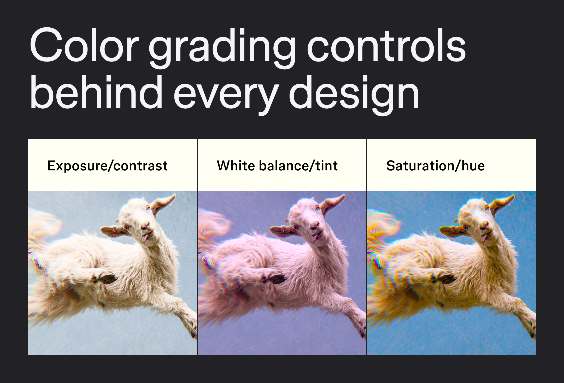
Color grading software looks a little different tool to tool, but it all comes down to adjusting the same handful of controls. Once you know what each one does, you can find it in Figma Weave, DaVinci Resolve, Lightroom, or anywhere else that offers a grading feature. Here’s what each pair handles.
Exposure sets how bright or dark the whole image looks, from a near-black frame to one that’s blown out.
Contrast sets the gap between the darkest and brightest parts of that same image, so a low-contrast shot looks flat and hazy while a high-contrast one looks punchy and graphic.
Both need to be right before you make any stylistic decisions, since grading a shot that’s underexposed just makes the exposure problem look more colorful.
White balance corrects the warm or cool color cast that different lighting leaves behind, like the orange of tungsten bulbs or the blue of open shade. This is usually the first adjustment made in a grading workflow, since it affects how every other control reads afterward.
Tint adjusts the balance between green and magenta, which often needs a small nudge once white balance is set.
Saturation controls how vivid or muted colors appear, from black and white at zero saturation to nearly neon at the high end.
Shifting the hue changes how a pixel reads, nudging a red toward orange or a blue toward teal.
Pushing either control too far is the fastest way to make a grade look unnatural, so small adjustments go a long way here.
Color grading doesn’t require expensive software to get right. What matters more is the sequence you follow.
These three easy color grading techniques for beginners work whether you’re grading video in a dedicated color suite or adjusting a photo in a simpler app.
Pick a reference image, a film still, or a brand mood board before you touch a single slider. Working toward something concrete is better than adjusting by feel and guessing when to stop.
Color correct first, fixing exposure and white balance. Then grade separately, adjusting saturation, hue, and mood in a second pass. Keeping corrective and creative adjustments separate makes it easier to tell whether something looks off because of a technical error or an intentional style choice.
A grade that looks right in RGB color on a screen can shift once it’s exported for print or a different display. CMYK’s printable color range is narrower than RGB’s, so some vivid colors that look accurate on screen can fall outside that range and look duller once converted. Confirm the export settings match where the piece is actually headed, then double-check the grade once it’s in that format. Never assume it will translate directly.
Most color grading workflows assume you’re starting with an existing photo or clip of footage, but this isn’t always true. More and more, visual content starts as an AI generation, which means traditional color grading advice built entirely around a camera shot doesn’t always apply.
Figma Weave has tools built for exactly this kind of AI color grading. You can give a mix of AI-generated and captured visuals a consistent look, using the same reference or mood board from the workflow above.
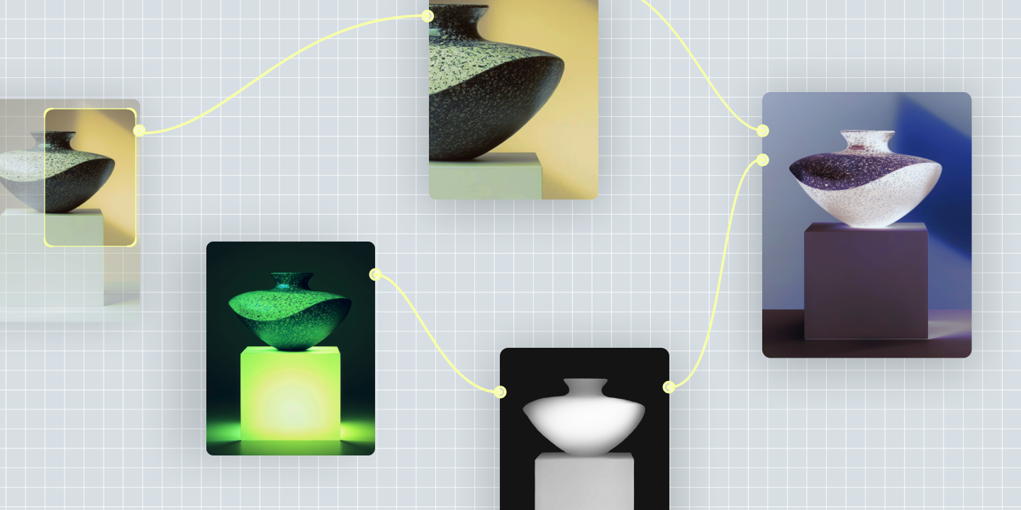
The Figma Weave Transfer style tool takes the visual style of a source image, like a reference photo or mood board, and applies it to a new image.
To carry that style across an entire workflow instead of just one image, pair Transfer style with the Image describer node. That turns the look into a written description you can reuse and adjust rather than trying to recreate it each time. The description can then become part of your team’s ongoing AI creative process instead of a one-off decision.
The Figma Weave Apply color palette tool lifts the color palette from one image and applies it to others. This is a quick way to keep a whole batch of AI-generated visuals looking like they came from the same color grade.
If your team is using AI in design across a real production pipeline rather than one-off generations, that consistency is what turns individual visuals into an actual set.
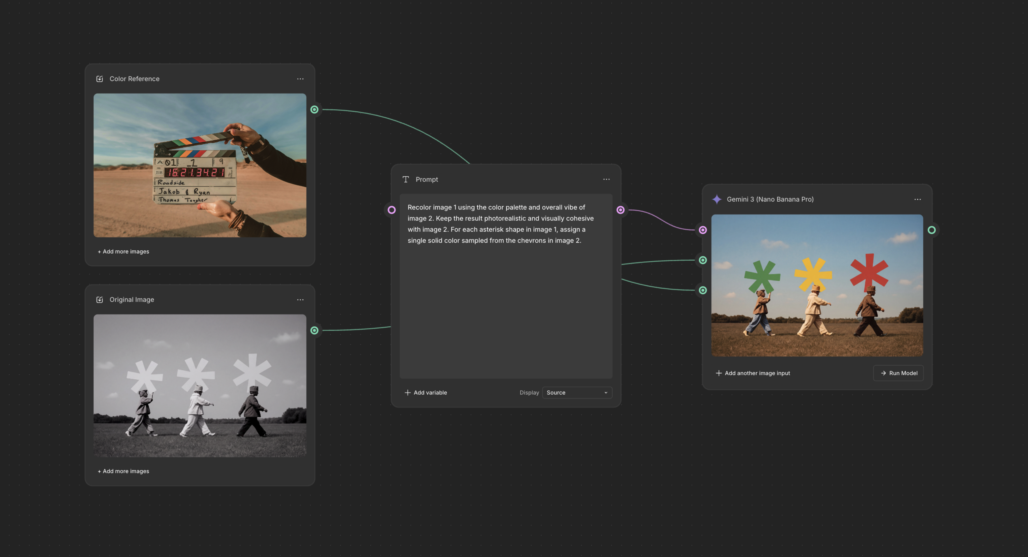
The Apply color palette tool pulls the color story from one image and applies it to another, so a new visual matches your grade in a click.
A few small steps can make the difference between a grade that looks intentional and one that looks like a basic filter. These aren’t hard rules, but they’re worth keeping in mind as you build your grading workflow.
Colorists lean on a few common conventions as a starting vocabulary, not hard rules. Cool blues and teals convey tension or distance, which is why they show up so often in horror and thrillers. Warm oranges and ambers read as nostalgic or adventurous, desaturated greens suggest sci-fi or dystopian settings, and high-contrast reds signal urgency or danger.
You can use these color associations to define the look you want in the Figma Weave Image describer or Transfer style tools. A prompt like “cool and desaturated” gives you a starting point you can refine before you touch a single slider.
The 60-30-10 rule is a color-distribution guideline borrowed from interior design:
When applied to grading or a color palette, this rule helps keep things from feeling chaotic. You don’t want every color to compete for attention at once.
Primary grading adjusts the whole frame uniformly, shaping the overall look of a shot. Secondary grading isolates a specific color, object, or region, like a sky, a product, or a skin tone, and adjusts that area without touching the rest of the image. Most grading workflows start with a primary pass and use secondary adjustments only where something specific needs extra attention.
Log wheels, also called color wheels, are the lift, gamma, and gain controls that let you push color into shadows, midtones, and highlights independently. That independence is what lets a colorist tint shadows cool while keeping highlights warm, instead of shifting the whole image’s color at once. Log wheels are one of the more precise tools available to you, once basic exposure and white balance are already set.
Color grading is what turns a technically correct shot into one with an actual point of view. If you’re ready to apply that same intention to a batch of photos, video, or AI-generated visuals, Figma Weave can help you match a color grade faster than switching between separate tools.
Here’s how the rest of Figma fits around a color grading workflow, from first sketch to final handoff:
Figma Weave brings AI generation and editing models into one workspace so you can shape a consistent look across every creation.
Pairing the right colors together creates harmony in UI designs. Learn 100 color combinations for your next project and how Figma can help.

The right color pairings can evoke emotions, increase brand awareness, and encourage user action. Discover how to create a compelling color palette with Figma.

Graphic design focuses on creating visuals to convey a message or story. Read on to learn about graphic design and how Figma can help.


Curious how AI in design is changing the way teams work? See how tools like Figma make it easier to bring ideas to life with real-world examples.

From image generators to node-based workflow platforms, here are 7 of the best AI tools for graphic design, and how each fits a real production process.

Avoid common design system scaling mistakes. Learn how to transition from a static library to a product infrastructure that aligns design and code at scale.
Build faster with Figma Weave