
39 impressive font pairings to elevate your designs
Learn how to use font pairings to elevate your designs, get tips for choosing the right font combination for your brand, and discover how Figma can help.
Skip to main content
Design basics
Bring type to life in every interaction.
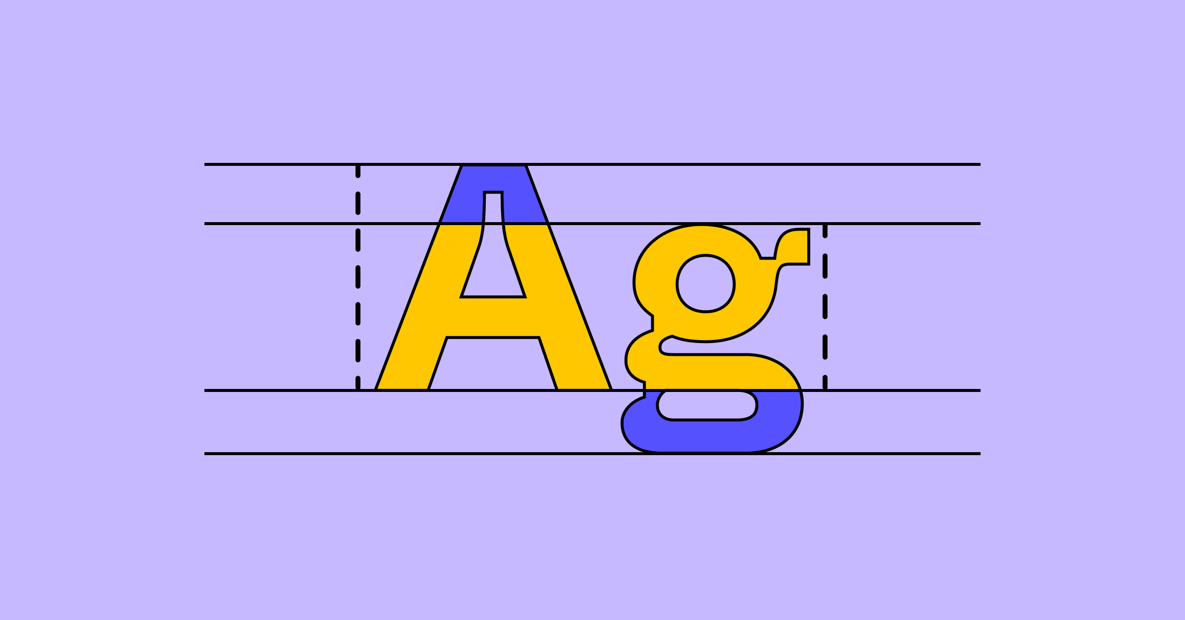
First impressions matter, as every brand pro knows. Most users will leave a web page very quickly if the content isn’t clear and compelling, so the details they see first count. Designers agree, with 57% of those surveyed in our State of the Designer 2026 report identifying visual polish and attention to detail as part of craft. Typography fundamentals are among those first details that shape how users read and see your brand.
Your creative team works hard to convey your brand message in engaging, accessible language. Now they’re counting on you to make good typography and design decisions for better readability and brand engagement.
Read on to learn more about:
Typography in design involves creating or selecting a system of typefaces and fonts to express the written word. This art form can evoke strong emotions, using visually appealing letters and arranging type to express your brand personality. Well-crafted typography can support clear communication, with legibility covering how easily readers distinguish letters, and readability referring to how comfortably they read passages.
Before computers, printers set text with individual metal letters that they could arrange. If looking at the movable metal type, the history of typography dates back to Korea with the Jikji, the oldest surviving book, produced in 1377. Johannes Gutenberg introduced metal movable type to Europe in the 1400s, and European printers soon added the Roman and italic typefaces we still use.
Today, typography in graphic design and on the Web draws on large libraries of typefaces and fonts. It plays a key role in creating quality websites, apps, emails, ebooks, and more.
Typography is important because it can help you:
Modern designers typically choose from five popular kinds of typefaces: serif, sans serif, script, monospace, and display. Each typeface includes a family of fonts that covers that typeface’s various styles. For example, Helvetica is a typeface, while Helvetica Light and Helvetica Regular are fonts.
Each typeface has its own look and best use case:
You can fine-tune the look, legibility, and mood of a word, line of text, or product by adjusting one or more typography elements.
This element is one of the core graphic design principles, creating balance and helping users move down a page. Align design elements, such as your logo, images, header, and body text, so the reader doesn’t have to jump around to find what to read next. Space each design element equally, and employ margins and padding consistently.
Alignment in typography also covers justification, which is how lines of text are positioned within a text box. Choose left justified, right justified, full justified, or centered text based on your project needs. Designers might center a heading or short quote, but left-justify long-form copy, so every line starts in the same place.
Here are some examples of justification:
Select a color palette that’s consistent with your brand and clearly conveys your message. Adjust text opacity and use complementary colors that contrast well against each other to ensure readability and accessibility. You can use a color wheel generator to create a well-balanced color palette. Bolder, brighter colors may work better for headings and subheadings, while neutral colors suit large blocks of text.
Pro tip: See Web Content Accessibility Guidelines (WCAG) for ideal contrast ratios. These guidelines set a minimum contrast ratio of 4.5:1 for regular text and 3:1 for large text, which WCAG defines as 18pt or 14pt bold and above. Enter your text and background colors in our color contrast checker to see the ratio and whether it meets WCAG standards.
Developing a text hierarchy in your typography helps prioritize and surface key information so it’s easy to scan and digest. Your main details here are size, weight, color, contrast, case, and space. Size is the strongest indicator of visual hierarchy. Make headings larger than subheadings, and subheadings larger than body text.
For example, website body text is typically 16px, with H1 headers set at 48px. Play with white space and different typefaces to reinforce visual hierarchy.
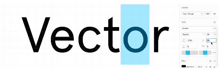
Kerning in typography is the space between individual letter pairs. Adjust the amount of space between individual letters so that the distance appears consistent. Proper kerning helps boost your text’s visual appeal while improving legibility.
Many design programs apply kerning automatically, but large display type and unusual fonts deserve a visual check.
Leading refers to line height, which is the distance between one text line’s baseline and the baseline of the text line above it. For body text, line height between 120% and 145% of the font size, or about 1.2 to 1.45 times, keeps lines easy to follow.
Layouts should also keep working when users set line height to 1.5 times the font size, which WCAG 1.4.12 requires. That said, every typeface requires fine-tuning and careful line spacing.
You can improve readability with tracking (aka character spacing), which covers the overall spacing between letters in a word or line of text. Unlike kerning, which adjusts specific letter pairs, tracking changes the spacing across a whole range of text.
Increase tracking to add space, and decrease tracking to reduce it. Words or phrases displayed in all capital letters are sometimes easier to read with increased tracking.
Line length is the distance between the left and right edges of a block of text, measured in characters per line. For body text in English, aim for about 45 to 75 characters, including spaces and punctuation. Longer lines make it harder for readers to find where the next one starts. If lines need to exceed 75 characters, increase the line height. The strictest level of WCAG sets 80 characters as the maximum width.
When laying out text, one aspect to examine is the rag. The rag is the uneven edge of left- and right-aligned text. You can adjust the rag by widening or narrowing the box, or by changing the letter spacing across the entire body of text.
That tweaking can leave a word stranded on its own line. When the last line of a paragraph lands alone at the top of the next column, it’s called a widow, and a first line left alone at the bottom of a column is an orphan.
However, as May-Li Khoe points out:
Referring to a word of text on a line by itself as a “widow” or “orphan” is kind of a bummer, especially because I am an orphan. I like calling it a dangly instead.
Refer to them as “danglies” instead.
These web typography numbers are starting points, so adjust them for your typeface, audience, and screen. Use the table as a quick reference when you set up type for a website or app:
| Element | Starting point | Why it matters |
|---|---|---|
| Body text size | 16px (1em), the usual browser default | Gives every other size a baseline to scale from |
| Contrast, regular text | 4.5:1 minimum, 7:1 at the stricter AAA level | Keeps text readable for people with low vision |
| Contrast, large text | 3:1 minimum, with large meaning 18pt (about 24px) or 14pt bold (about 18.7px) | Larger letterforms are easier to see, so the minimum is lower |
| Line height, body | 120–145% of font size, and layouts should hold when users set 1.5× | Keeps lines from feeling cramped or loose |
| Line length | 45–75 characters, 80 at most | Helps readers keep their place from line to line |
| Text resizing | Layouts should hold up at 200% | Lets users enlarge text without losing content |
| Font weights | 100–900 scale, with 400 for regular and 700 for bold | Gives designers and developers shared numbers in CSS |
In Dev Mode, developers can inspect text styles and variables, so the numbers you choose are easy to find at handoff.
Font properties are the settings that define how a font looks, from its weight and style to its size. While key elements in typography design are arranged on the page, font properties change the letters themselves. Let’s take a look at some aspects of font properties:
Weight refers to the thickness of a letter’s stroke. A typeface can range in weights from hairline to ultra-black and have many fonts in between, while some typefaces may come in only one weight. These weights also have a number association, which is helpful to understand when programming or collaborating with a developer. Weights generally coordinate to a number on a scale of 100 to 900, with intervals of 100: Regular 400, Medium 500, Semi-Bold 600, Bold 700, etc.
For example, Montserrat by Julieta Ulanovsky and studio has multiple styles and weights, such as regular, bold, italic, thin, black, and each has a font. A font is a file for installing and using a set of type in a particular font weight and text style. A typeface with multiple weights has a font for each weight, together they are known as a font family.
Limit a layout to two or three weights so hierarchy stays clear, and use the font’s bold file.
Font style is the adjustment of the characters or case, such as italics and all caps, respectively. Some typefaces have no style option, and sometimes only offer a Regular weight.
Letter case, also referred to simply as “case,” is the distinction between smaller letters like lowercase and larger letters like uppercase or capital letters. Most typeface sets have letters in both, while fonts like Bangers are set in uppercase only. Typefaces set in only uppercase or only lowercase letters are far less common.
In English, the various case styles are used differently, depending on the circumstances:
Setting and changing the type size of type can be a difficult decision. It depends on the medium, such as paper, a mobile phone, or a billboard, and it can change with the viewer’s device and your design’s responsiveness. Use size as one of your main elements of emphasis when you build hierarchy.
In web development, some key sizes need to be defined, such as the heading, subheading, body text, menu and footer text. Many designers start with the heading size, also known as the H1, but it may be helpful to begin with the body text size, as that is how front-end developers might implement it. When a developer works in ems, a unit of measure based on scaling, the body text size is 1em and every other text size is a multiple or fraction of it.
For example, a common body text size for the web is 16px. The H1 may be set at 3em, or three times the body text size, in this case 48px. Because the web page will be designed for multiple screen sizes, the designs you create may require different font sizes depending on the customer’s device. The developer can have the body text size change with the browser dimensions of your customer, and all other text will scale accordingly.
To keep sizes consistent, pick a set of sizes, called a type scale, and reuse it across your designs.
The process for choosing a typeface breaks down into these key steps:
Collect typeface ideas and brand references on a shared online whiteboard.
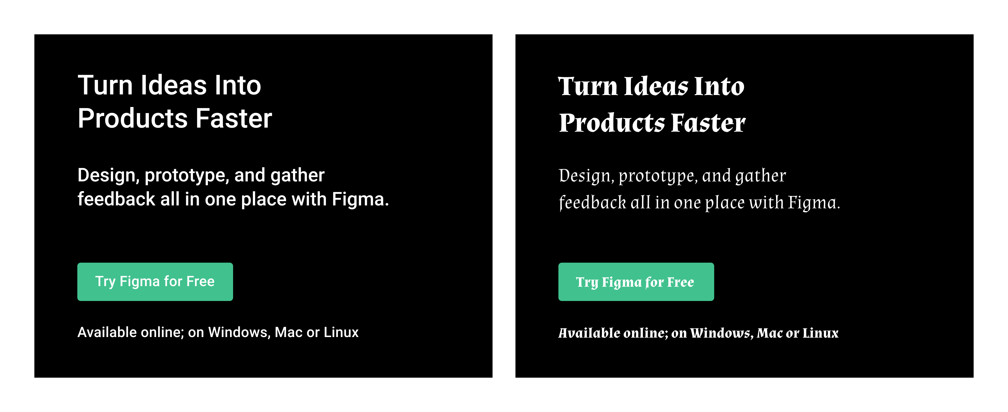
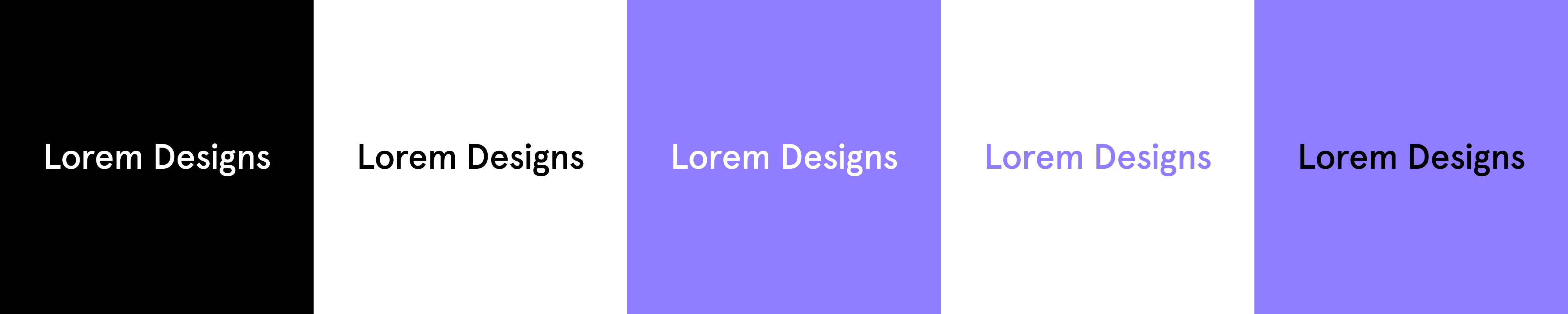
Typography has no single official golden rule, but a good working one is to put readability first. Type should make content easy to read before it does anything else. The fundamentals, including contrast, line height, and line length, all serve that goal.
A typeface is the overall design of a set of letters, such as Montserrat, while a font is one weight and style of that design, such as Montserrat Bold. In everyday use, many people use the two terms interchangeably.
Web typography best practices start with readable defaults: 16px body text and a contrast ratio of at least 4.5:1 for regular text. Keeping lines to 45–75 characters and letting text resize up to 200% without losing content matter are equally important.
Typography fundamentals focus on choosing a typeface that customers can read clearly and that helps connect with your brand. Trying a few typefaces in your own project shows how those fundamentals play out. When you’re ready to find the right type for your brand, we’d love for you to try Figma.
Here’s how to get started:
Create text styles for headings and body text, then fine-tune variable fonts as you design with Figma Design.
Learn how to use font pairings to elevate your designs, get tips for choosing the right font combination for your brand, and discover how Figma can help.

Read on to learn more about the best fonts for websites in 2026, how to find the right typeface for your brand, and how Figma can help.

Looking for a high-tech, modern typeface? Explore 32 futuristic fonts to upgrade your projects with cutting-edge sci-fi flair and space-age aesthetics.

Discover 34 sleek and stunning minimalist fonts that bring simple elegance to your designs. Find the perfect fit for logos, websites, posters, and more.

From serif and script folds to mid-century modern, discover how modern fonts can add elegance and flair to your Figma designs.

Discover the best script fonts from Figma for elegant designs. From wedding invitations to engagement websites, cursive fonts are ready to deliver.


At trusted titles like The New York Times, The Economist, and The Minnesota Star Tribune, great design can support great journalism. Here’s how media teams use Figma to collaborate on news design and explore new formats.
As Figma expands to include tools for all product builders, our community has evolved—and so has our brand. We’ve overhauled our entire visual identity from color palette to illustration style, and even commissioned a new typeface.

Our grant program empowers the community to make free resources for all. From a kit for building immersive environments, to a design-to-code plugin, to a text animator, these tools have helped nearly a million people create in Figma.
Every product has a story. Often, that story unfolds in Figma. Shortcut’s mission is to tell stories about people, and the priorities, plans, and pivots they discover along the path of bringing new ideas to life.
We talk with people about what makes them a maker. Here, a design manager tells us about his latest project, a book covering 150 years of keyboard design.
Grilli Type's Theirry Blancpain on the promise and expressive ease of variable fonts.