
31 best serif fonts to elevate your designs
Learn 31 best serif fonts to elevate your designs and best practices for choosing the right fonts for your brand. Then discover how Figma can help.
Skip to main content
Design basics
Bring type to life in every interaction.

Sometimes, less is more. Minimalist fonts can bring simple sophistication to a design, enhancing readability and creating a clean, polished aesthetic. In our State of the Designer 2026 report, 58% of designers surveyed named visual design and polish as among the most in-demand skills.
Typography is one area where those skills can be applied. Open letterforms and steady spacing help people read a design with less effort, and they set its tone. Whether you’re designing a logo or an entire brand, the right minimalist typeface can make a powerful statement.
Read on to learn:
| Font | Style | Ideal for |
|---|---|---|
| Manrope | Neo-grotesque sans serif | Branding, logos, websites, headlines, interfaces, body text |
| Poppins | Geometric sans serif | Body text, websites, branding, mobile apps |
| Work Sans | Neo-grotesque sans serif | Headlines, logos, interfaces, body text |
| Karla | Neo-grotesque sans serif | Body text, headlines, interfaces |
| Dongle | Rounded sans serif | Websites, social media, posters, packaging, multilingual projects |
| Raleway | Geometric sans serif | Headlines, logos, branding, body text |
| Inconsolata | Monospace | Coding, technical documentation, body text, websites |
| Comfortaa | Rounded sans serif | Titles, headlines, websites, body text, posters, brochures |
| Antic | Humanist sans serif | Websites, branding, magazines, books |
| Actor | Humanist sans serif | Logos, branding, headlines, signage, websites |
| Agdasima | Humanist sans serif | Technical documents, online forms, spreadsheets, tables |
| Hanken Grotesk | Neo-grotesque sans serif | Websites, mobile apps, books, body text, interfaces, signage |
| Basic | Geometric sans serif | Websites, social media, presentations, brochures |
| Cabin | Humanist sans serif | Websites, e-books, blog posts, headlines |
| Cantarell | Humanist sans serif | Websites, blog posts, body text, interfaces |
| Inter | Neo-grotesque sans serif | User interfaces, Web design, mobile apps |
| Hind | Humanist sans serif | Interfaces, mobile apps, websites, multilingual projects |
| Gowun Batang | Transitional serif | Books, articles, academic papers, websites, body text, multilingual projects |
| Jost | Geometric sans serif | Headlines, logos, body text, branding, interfaces |
| Krub | Humanist sans serif | Branding, body text, multilingual projects |
| Lato | Humanist sans serif | Body text, websites, branding, interfaces |
| Nunito | Rounded sans serif | Headlines, logos, body text, websites, branding, signage, interfaces |
| Epilogue | Geometric sans serif | Websites, articles, presentations, branding, headlines, body text |
| Open Sans | Humanist sans serif | Logos, branding, websites, interfaces |
| Sintony | Neo-grotesque sans serif | Websites, editorial design, body text, corporate communications |
| Montserrat | Geometric sans serif | Headlines, branding, posters, websites |
| Rethink Sans | Neo-grotesque sans serif | Websites, user interfaces, corporate documents, digital platforms |
| Space Grotesk | Neo-grotesque sans serif | Websites, interfaces, tech brands |
| Geist | Neo-grotesque sans serif | Websites, headlines, logos, posters, user interfaces, branding |
| Sofia Sans | Neo-grotesque sans serif | Branding, websites, signage, editorial design |
| Source Serif 4 | Transitional serif | Books, articles, long-form Web content, editorial design, professional documents |
| Scheherazade New | Arabic naskh | Arabic typography and bilingual (Arabic/Latin) publications |
| DM Sans | Geometric sans serif | Interfaces, body text, branding |
| Roboto | Neo-grotesque sans serif | Websites, interfaces, branding, body text |
| Mulish | Geometric-humanist sans serif | Body text, websites, presentations |
| Outfit | Geometric sans serif | Websites, branding, headlines |
| Cormorant Garamond | Old-style serif | Headlines, titles, editorial design |
A minimalist font is a typeface characterized by clean lines, simple letterforms, and a lack of decorative embellishment. These clean fonts avoid intricate details, focusing instead on clarity and readability.
Most minimalist fonts are sans serif, though other options work well depending on what you’re going for. Among sans serifs, geometric fonts like Poppins and Montserrat build letters from circles and straight strokes, while neo-grotesque fonts like Inter and Roboto keep neutral forms with even strokes. Monospace fonts keep every character the same width, such as Inconsolata, making them ideal for technical environments.
Humanist fonts like Open Sans and Cabin borrow open shapes from calligraphy without its flourishes, keeping them as plain as geometric styles. Many fonts can be considered minimalist, but what matters is ensuring your type doesn’t distract from your design.

Manrope is a modern sans serif with open letter shapes and a calm, even look. It brings a modern touch to designs while maintaining excellent readability across platforms and sizes. Manrope is also a variable font that includes a range of weights in a single file, so you can build headings and interface text from a single family.
Best for: Branding, logos, websites, headlines, interfaces, body text

Poppins is a geometric sans serif featuring clean, even lines. That gives websites and mobile apps a polished, friendly look, and the even line thickness keeps text looking uniform. Its minimalist design makes it versatile for body text and display, and its extensive character set supports multiple languages and scripts.
Best for: Body text, websites, branding, mobile apps

Work Sans is a simple, neutral sans serif designed for readability across screen and print. Designer Wei Huang was inspired by early grotesque fonts but wanted to incorporate a modern and friendly touch.
The middle weights of the family are optimized for on-screen text usage at medium sizes, while the more extreme weights are ideal for display purposes. Its large x-height, the height of lowercase letters, makes text look bigger at small sizes for better legibility. Larger accent marks also help characters like é and ñ stay easy to tell apart.
Best for: Headlines, logos, interfaces, body text

Karla keeps its letterforms clean and straightforward, which suits text-heavy screens that require excellent readability. A generous x-height makes lowercase letters look larger at the same size, and its weights run from ExtraLight to ExtraBold, so you can build headings and body text from one family. It works well across digital and print projects.
Best for: Body text, headlines, interfaces, multilingual projects

Created for the Korean language, Dongle is a charming, rounded sans serif typeface. Its soft forms and modular structure give it a friendly, approachable feel. The warm tone, combined with its clear legibility, makes this typeface suitable for a social media graphic or an inviting packaging design. While initially designed for Hangeul typography, Dongle also supports Latin and Vietnamese, making it versatile for multilingual projects.
Best for: Websites, social media, educational materials, posters, packaging, multilingual projects

Originally designed as a single thin weight, Raleway expanded into a full family with nine weights. This opened up possibilities for numerous Raleway font pairings.
Its elegant sans serif structure blends geometric and humanist influences, making it a versatile choice for display, branding, and body text..
Best for: Headlines, logos, branding, body text

Inconsolata is a monospace font that keeps technical documents clean and code lined up in snippets and terminal output, making it suit developer-facing products. It draws on inspiration from classic typefaces like Consolas.
Its humanist touches and clear letterforms also make it ideal for body text in documents or retro-style Web pages.
Best for: Coding, technical documentation, body text, websites

With a focus on comfort and readability, Comfortaa has smooth, rounded shapes and an approachable feel.
Comfortaa’s excellent legibility and friendly aesthetic make it popular for children’s designs or projects that want to convey warmth, both in digital and print applications like posters, flyers, and brochures.
Best for: Titles, headlines, websites, body text, posters, brochures

Antic, created by Santiago Orozco, is a sleek font that blends a clean sans serif structure with subtle calligraphic warmth. Its subtle stroke modulation adds personality without losing the simplicity needed for minimalist designs.
Best for: Websites, branding, magazines, books

Actor is a contemporary sans serif with a strong geometric structure and a hint of calligraphic influence. Highly legible and versatile, Actor works well in both display and body text applications. Its numerals feature a curved seven and distinct six and nine shapes, giving logos and headlines a recognizable look.
Best for: Logos, branding, headlines, signage, websites

Agdasima is a unique sans serif typeface designed to improve document compatibility, with narrow, compact letters fitting into tight spaces that need it, like form fields or table cells.
Agdasima’s efficient design makes it a reliable choice for ensuring documents display correctly across different platforms and software. It was built to keep text from reflowing in Microsoft Office documents, helping layouts hold steady in spreadsheets and forms.
Best for: Technical documents, online forms, spreadsheets and tables

Hanken Grotesk is an open-source typeface inspired by the classic grotesques of the 19th century. The font design is characterized by simple, neutral letter shapes and open spacing inside the letters, so text stays clear on websites and in mobile apps.
Classified as a grotesque sans serif, Hanken Grotesk blends a modern look with timeless appeal. The family includes a variety of weights, allowing for nuanced typographic expression. Its clean, geometric build suits both physical and digital media.
Best for: Websites, mobile apps, books, body text, interfaces, signage

Basic is a geometric sans serif with very even strokes, so letters look consistent from small body text to large headings. Familiar shapes with a slight twist keep it from feeling generic, which suits a minimalist layout that still needs some character. One family can cover a website and a slide deck, making it a go-to font for a wide range of applications for many designers.
Best for: Websites, social media, presentations, brochures

Cabin, designed by Pablo Impallari in 2010, blends traditional and modern influences. Inspired by Eric Gill and Edward Johnston, it features steady strokes and rounded letter shapes, which give longer texts like blog posts and e-books a soft, easy look. It comes in weights from regular to bold, plus a condensed width for narrow spaces like sidebars and cards.
Best for: Websites, e-books, blog posts, headlines

Designed in 2009 by Dave Crossland as part of his master's thesis at the University of Reading, Cantarell is a contemporary sans serif typeface optimized for on-screen reading in mind. It was first made for an early smartphone, the HTC Dream, so small mobile screens shaped its design.
Its tall x-height and relatively wide proportions create a warm yet highly legible appearance, making it a natural pick for mobile apps and text-heavy blog pages.
Best for: Websites, blog posts, body text, interfaces

Inter was designed for computer screens by Figma designer Rasmus Andersson, with small interface text in mind. Its tall x-height, large apertures (the open spaces inside letters), and clean geometric forms make it ideal for labels and easy navigation on user interfaces and apps. Inter works well for headings, but truly shines in body text and web design elements.
Best for: User interfaces, Web design, mobile apps

Hind, designed by Manushi Parikh for the Indian Type Foundry in 2014, supports both the Devanagari and Latin scripts. With open letterforms, monolinear strokes, and a focus on clarity, it’s a strong choice for Web and UI designers where readability is key.
Best for: Interfaces, mobile apps, websites, multilingual projects

Gowun Batang is an elegant serif typeface inspired by neat pencil handwriting, with delicate strokes that suit longer reading. With balanced proportions and graceful flow, it excels in body text for books, academic papers, and editorial design, creating a calm and inviting reading experience. It supports Korean, Latin, and Vietnamese scripts, so it works for multilingual products and layouts.
Best for: Books, articles, academic papers, websites, body text

Jost is a contemporary font inspired by 1920s geometric German sans serifs, which gives it a clean, balanced look with a vintage touch. With open letterforms and a focus on functionality, its extensive range of weights and styles makes it a versatile choice for branding, editorial, Web design, and user interfaces.
Best for: Headlines, logos, body text, branding, interfaces

Krub blends the traditional looped letterforms of Thai script with the structured elegance of Latin lettering. Its balanced design and subtle stroke modulation add personality, while its strong legibility makes it a versatile choice for both body text and display uses.
Best for: Branding, body text, multilingual projects

Lato started as a typeface for a corporate identity, and it keeps that serious tone with a warm edge. Its traditional letter proportions and clean, modern finish suit business websites and brand work that needs to feel professional but not stiff. Its versatility excels in a wide range of design contexts, including both body text and display applications.
Best for: Body text, websites, branding, interfaces

Nunito is a sans serif typeface by Vernon Adams and Jacques Le Bailly, known for its friendly rounded terminals and modern geometric design. Originally for display, it now includes a full range of weights and a non-rounded version called Nunito Sans. That expansion has made it suitable for both headlines and body text.
Best for: Headlines, logos, body text, websites, branding, signage, interfaces

The minimal aesthetic of Epilogue comes through in its structured form and a warm but clear-cut look. This font’s strength lies in its versatility, with nine weights, each available in italics, giving you room to build a full hierarchy.
The design emphasizes simplicity and functionality, making it a reliable choice for a wide range of content, from professional and corporate to creative and artistic.
Best for: Websites, articles, presentations, branding, headlines, body text

Released in 2011, Open Sans quickly gained popularity for its neutral but inviting look across various platforms and applications.
Optimized for print, Web, and mobile interfaces, its extensive character set supports a wide range of languages. Open Sans is a true workhorse for designers and developers, as it works well in logo design and various graphic design projects thanks to its legibility.
Best for: Logos, branding, websites, interfaces

Sintony’s slightly square structure and smooth stroke modulation give it a clean and contemporary feel. Open letterforms and generous spacing contribute to its excellent legibility.
This modern minimalist font is a reliable choice for designers seeking a typeface that works well in both small and large sizes while maintaining a clean aesthetic.
Best for: Websites, editorial design, body text, corporate communications
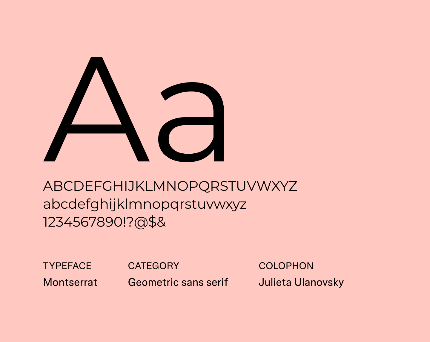
Montserrat is a geometric sans serif inspired by old street signage in Buenos Aires, which gives brand identities and headlines a clear, confident presence. Its range of weights covers everything from bold headlines to smaller text. It also supports Latin, Cyrillic, and Vietnamese scripts.
Best for: Headlines, branding, posters, websites

Rethink Sans is a sans serif font designed for clarity and functionality in digital contexts. The font incorporates thoughtful features like size-specific tracking and tabular lining figures to enhance its usability. This makes it well-suited for various applications, as it excels in both display and text settings.
Best for: Websites, user interfaces, corporate documents, digital platforms
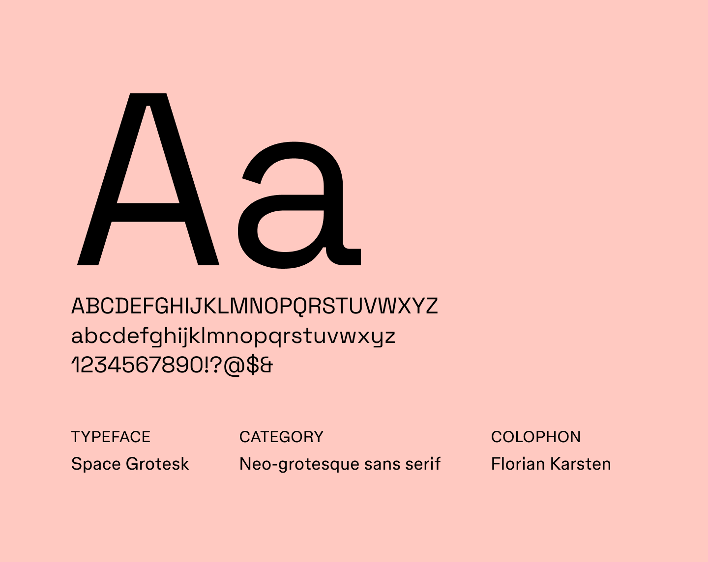
Space Grotesk is a neo-grotesque sans serif that grew out of the monospace font Space Mono and kept some of its distinctive details. Those details give it a technical character that suits tech brands, and its focus on readability makes it a fit for websites and interfaces.
Best for: Websites, interfaces, tech brands

Geist is a modern font that draws inspiration from classic Swiss typography. With a focus on legibility and simplicity, the clean geometric forms and precise lines give it a neutral yet sophisticated aesthetic. Geist works great for projects that prioritize a minimalist and contemporary look.
Best for: Websites, headlines, logos, posters, user interfaces, branding

Sofia Sans is a geometric sans serif typeface initially designed for the capital city of Bulgaria, Sofia. The narrow shapes fit more text into tight layouts, like navigation bars and cards, while the soft corners add warmth to branding and editorial design.
Best for: Branding, websites, signage, editorial design

Source Serif 4 iis a contemporary typeface designed for extended reading with a classic look that fits editorial design. Its elegance and clarity also make it a strong choice for editorial design and corporate communications. Balanced proportions, moderate contrast, and subtle calligraphic influences result in a refined and versatile design that’s easy on the eyes.
Best for: Books, articles, long-form Web content, editorial design, professional documents

While its primary purpose is for Arabic text, Scheherazade New’s sophisticated aesthetic can be used in a variety of design projects that incorporate both Arabic and Latin scripts. With calligraphic influences and elegant, flowing letterforms, it reflects traditional Arabic typography while providing clarity and readability in modern contexts.
Best for: Arabic typography and bilingual (Arabic/Latin) publications
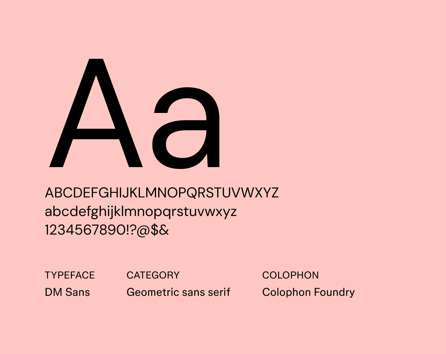
DM Sans is a geometric sans serif with even strokes and soft ends, which give text a calm, structured look. Its clean lines suit small sizes, so it works for body copy and interface labels. A wide weight range and an optical size setting that tunes letter details to the text size let one family cover headlines, too.
Best for: Interfaces, body text, branding

Roboto, developed by Google and designed by Christian Robertson, is a minimal typeface family. Introduced in 2011 as the Android 4.0 system font, it’s now widely used. Its extensive language support, weights, and styles make it highly versatile and a top choice for designers.
Minimalistic fonts like Roboto are among the best fonts for websites due to their clean aesthetic and focus on legibility across various screen sizes and resolutions.
Best for: Websites, interfaces, branding, body text
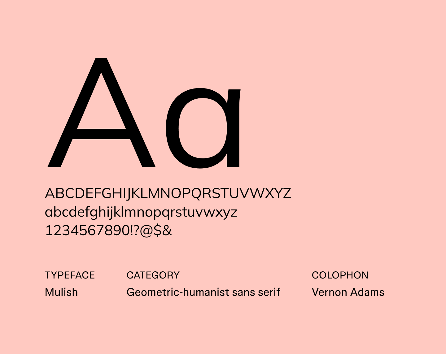
Mulish is a minimalist sans serif that mixes the round, simple shapes of geometric fonts with the open feel of humanist ones. That balance suits body text and lets it sit quietly beside a more expressive headline font. It supports Cyrillic and Vietnamese scripts, and a variable-weight setting lets you fine-tune the weight.
Best for: Body text, websites, presentations
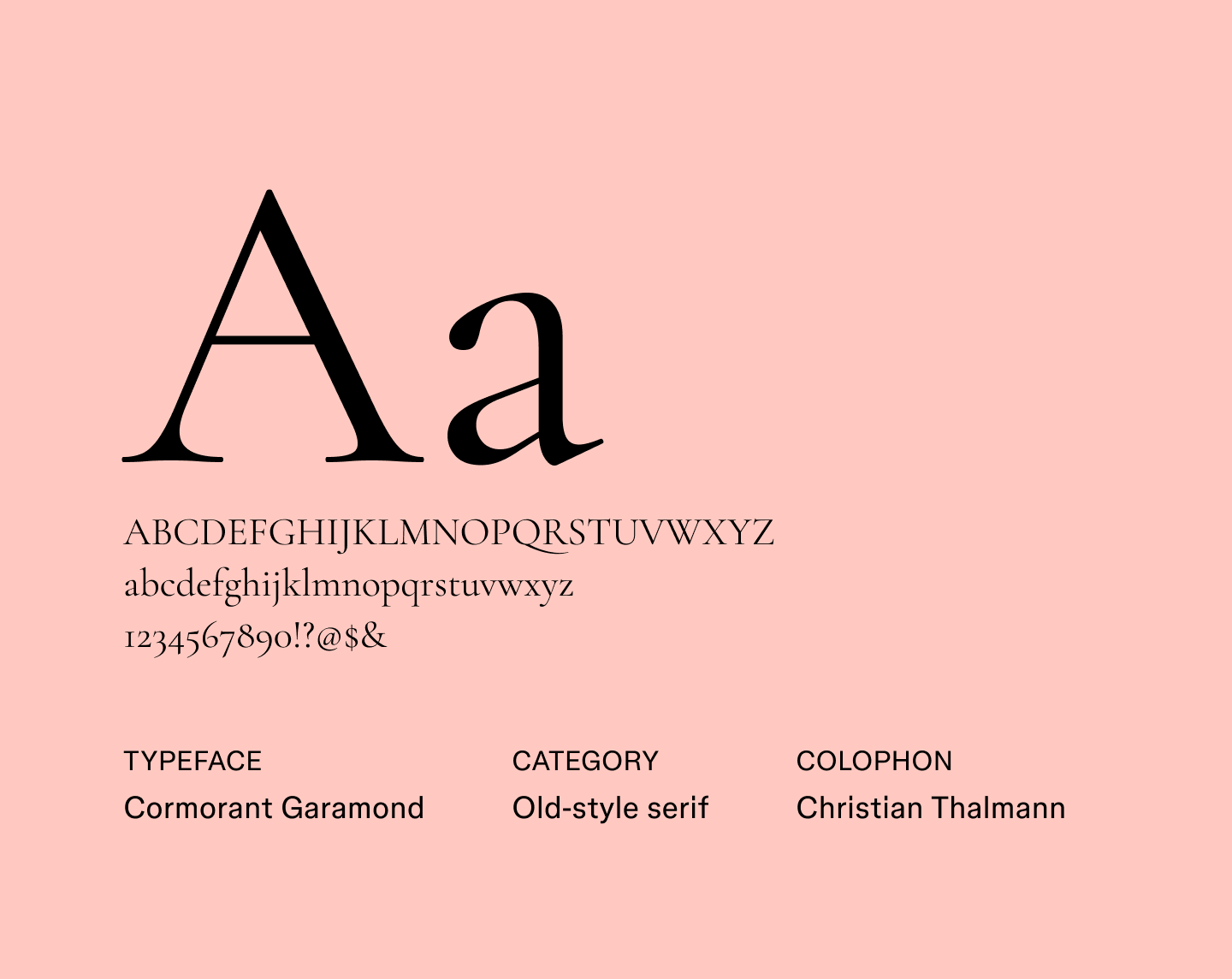
Cormorant Garamond is an elegant serif inspired by classic Garamond, with fine strokes that show best at large sizes. In a minimalist layout, a single Cormorant Garamond headline over plain body text adds a classic touch without extra decoration.
Best for: Headlines, titles, editorial design
Minimalist typography shines when it’s used thoughtfully. Keep these best practices in mind to create clean, polished designs:
Describe a page or app screen and test how a font looks in an interactive prototype.
The simplest approach to font pairings is to let one font carry the headline and a quieter one carry the body. Each pairing below uses fonts available in Figma:
Alternatively, use a single family, such as DM Sans across its wide weight range, with a heavy weight for headlines and a regular one for body text. Save each pairing as a text style in Figma Design so each screen reuses the same pairing.
Minimalist fonts leave little to hide behind, so spacing and hierarchy carry the design. Choose the one that fits your project, then set it up so every screen follows the same rules. In Figma, you can keep those rules in one place to create a polished, consistent look.
Here’s how:
Set text styles once in Figma Design, then reuse them across your file.
Learn 31 best serif fonts to elevate your designs and best practices for choosing the right fonts for your brand. Then discover how Figma can help.

Looking for professional fonts to use? Explore the 28 best professional fonts to make a strong impression and how Figma can help in this guide.

Discover the best fonts for logos. From modern fonts to creative possibilities, discover logo ideas for your brand’s unique style.

Read on to learn more about the best fonts for websites in 2026, how to find the right typeface for your brand, and how Figma can help.

From serif and script folds to mid-century modern, discover how modern fonts can add elegance and flair to your Figma designs.

Learn how to use font pairings to elevate your designs, get tips for choosing the right font combination for your brand, and discover how Figma can help.

At trusted titles like The New York Times, The Economist, and The Minnesota Star Tribune, great design can support great journalism. Here’s how media teams use Figma to collaborate on news design and explore new formats.
As Figma expands to include tools for all product builders, our community has evolved—and so has our brand. We’ve overhauled our entire visual identity from color palette to illustration style, and even commissioned a new typeface.

Our grant program empowers the community to make free resources for all. From a kit for building immersive environments, to a design-to-code plugin, to a text animator, these tools have helped nearly a million people create in Figma.
Every product has a story. Often, that story unfolds in Figma. Shortcut’s mission is to tell stories about people, and the priorities, plans, and pivots they discover along the path of bringing new ideas to life.
We talk with people about what makes them a maker. Here, a design manager tells us about his latest project, a book covering 150 years of keyboard design.
Grilli Type's Theirry Blancpain on the promise and expressive ease of variable fonts.