
12 design system examples to help you build your own
Explore 12 inspiring design system examples from top companies and the Figma Community. See how teams build consistency, scale, and collaborate effectively.
Skip to main content
Design basics
All your design work, in one place.
One team can keep a design system in their heads. Five teams, each shipping their own product, can’t. Enterprise design systems exist for that reason. They give a component library the governance and documentation it needs to work the same way for a hundred designers as it does for one. But building that takes deliberate choices about what goes into the system and who gets to change it.
Read on to learn:
Fragmentation usually starts the same way. A team needs a component that the shared library doesn’t cover, and the request queue is two weeks long. So the designers detach an existing component and rebuild it to fit their needs. Nobody notices until four versions of the same component are in circulation, each with its own focus states.
Brand drift follows the same path. Teams working in different tools fill the gaps the system left open. The blues run a little warm on marketing pages, and the mobile buttons get rounded corners that the Web version never had. Eventually, the product stops looking like one product.
Engineering is the last to feel the drift. With different versions of a component in design, developers have to ask which one is correct before building anything. Those differences surface in code review or QA.
A design system rests on the same few pieces, and enterprise scale raises the stakes on each one. Here’s what the foundation of an enterprise design system should include.
Design tokens are named values that hold your core design decisions. You give a team primary-blue instead of #0D99FF, and that name points to the same value in Figma Design as in your codebase. Change the token once, and all components referencing it will update.
Tokens keep the system coherent when nobody has full visibility into it. A designer on a new product team gets the right blue without knowing your brand history, and an engineer doesn’t have to check whether the spacing is 12 or 16 pixels. Tokens matter most across platforms, where teams build in separate codebases and drift is hardest to catch.
Your component library contains the reusable UI pieces that teams build with, like form fields, navigation patterns, and every button state your product needs. A good library covers the common cases well enough that reaching for it beats starting from scratch. Teams stop making the same decisions over and over, and the decisions they do make stay consistent by default.
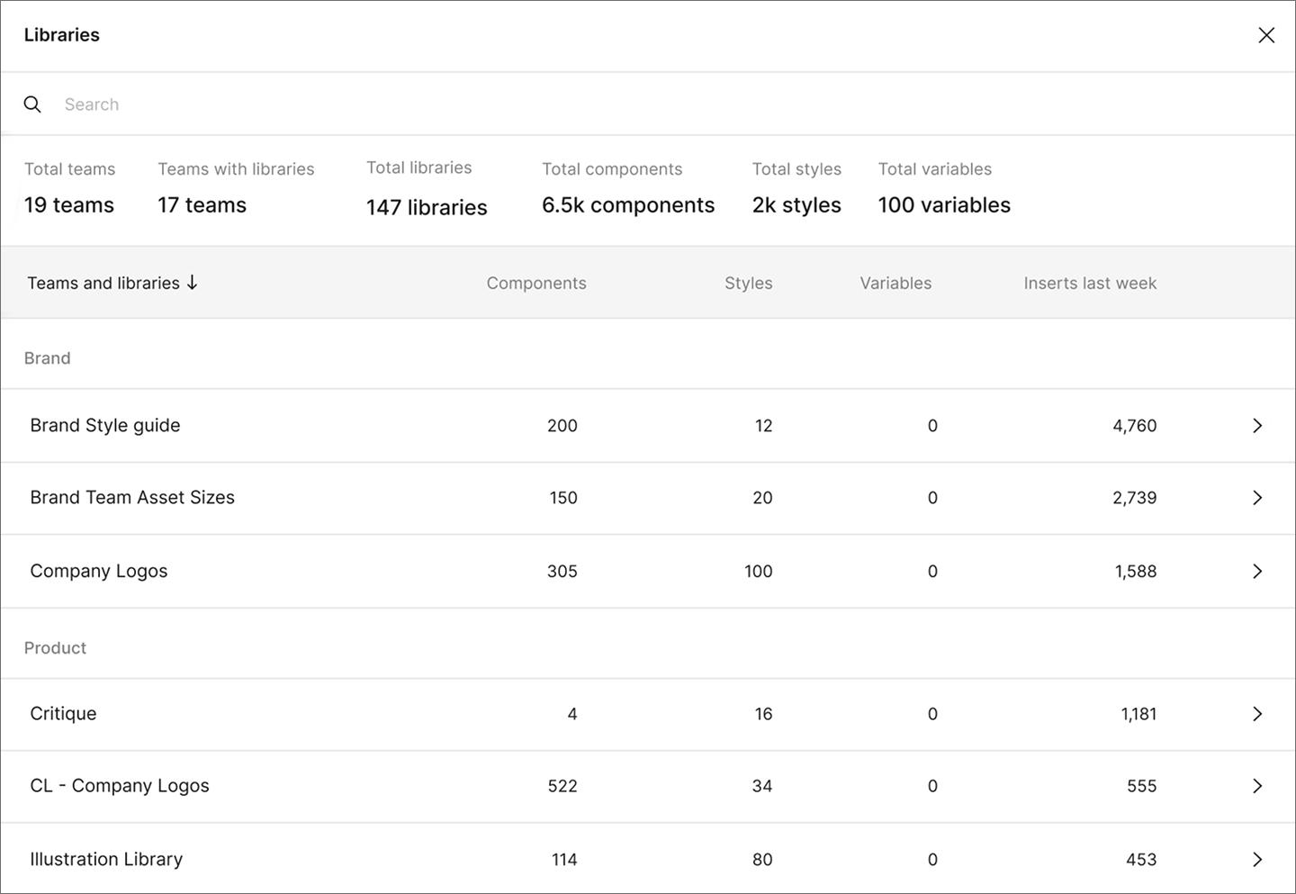
Adoption is the real test. Designers skip libraries they can’t navigate, and they rebuild what the library doesn’t cover. The Figma Design System Analytics show which components teams use, detach, or skip.
Figma Design is where teams create and maintain the shared libraries that a design system runs on.
Documentation explains what each component is for and how it behaves in edge cases. Without it, teams interpret components on their own. Say your system has a filled button and an outlined one. One team uses the filled version for Save and the outlined version for Cancel. Another team flips them. Now the same visual weight means two different things depending on which product someone opens.
The risk is highest on components that look interchangeable at a glance. Two similar buttons with different purposes need a written rule, or teams will pick whichever one they saw last. To get a head start, you can use Figma Make to generate descriptions for your components.
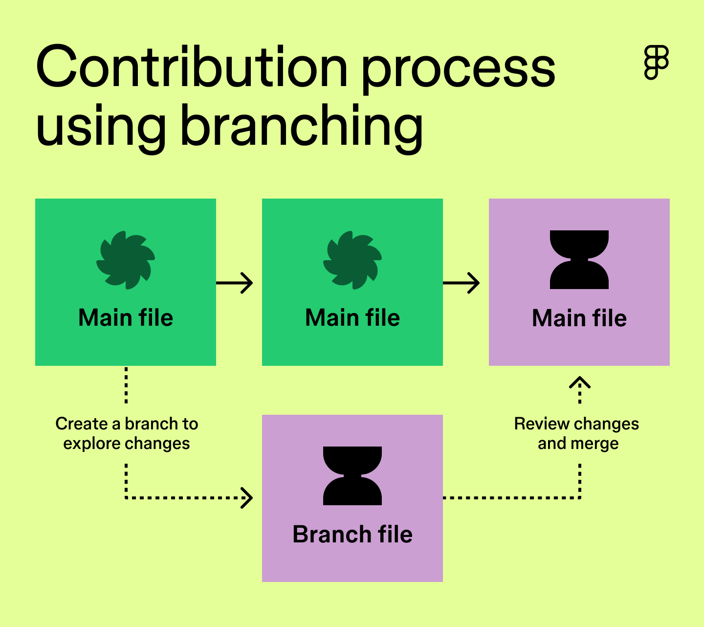
A contribution process defines how a new component goes from one team’s idea to something everyone can use. It’s also the part of design system implementation teams most often skip, which can leave new components without a clear path into the shared library. A designer proposes an update, and the system owner reviews it against your standards before publishing it with documentation. Retirement needs a clear plan, too. A set timeline ensures outdated components are phased out and eventually removed from the library.
Without a defined path, contribution either stalls or sprawls. Branching in Figma Design adds structure. A designer creates a separate version of the library file, makes their changes there, and merges them back into the main file once review clears.
Governance at enterprise scale comes down to how much you centralize. Too much central control can slow teams down, while too much autonomy can lead to duplicate components and an inconsistent library. These four factors tell you where your organization should land on that spectrum.
Start with considering how many people are building from the system. One product with a dozen designers can stay aligned without much formal governance, since everyone can be part of the same conversation. But once you’re supporting several product lines, that kind of coordination becomes impossible.
The more teams using the system, the more centralized decision-making you’ll generally need. Every new team brings another interpretation of what a component is for, and those interpretations compound until you spot multiple versions of the same pattern. At that size, you need one owner to approve what enters the library.
Decide how much room each team gets to deviate. Some organizations need every product to use the same components, especially when customers move between them in one session. Other organizations support different products, like an admin tool and a consumer mobile app, that don’t need the same level of consistency.
Most enterprise systems land somewhere in the middle, giving teams flexibility on composition while holding the line on tokens. A team can assemble components however their product needs, but spacing and color come from the same source everywhere. Define that boundary clearly so teams know where the flexibility ends.
Every system eventually faces a choice between shipping faster and staying consistent, which means someone has to make the call. In most organizations, that decision falls to a systems lead who owns the library day-to-day or a design operations function with a broader remit. Either works. Teams get in trouble when they leave the task unassigned, because the decision ends up with whoever pushes hardest in the moment.
Design system governance takes staffing. Reviewing contributions and maintaining documentation can take hours out of your team’s week. Plenty of organizations can’t dedicate a full team to that work.
Let that constraint shape your model. A part-time owner with clear standards and a short review queue beats an elaborate governance structure nobody has time to run. Start with the lightest process that keeps drift in check, then add structure as your design system scaling needs grow.
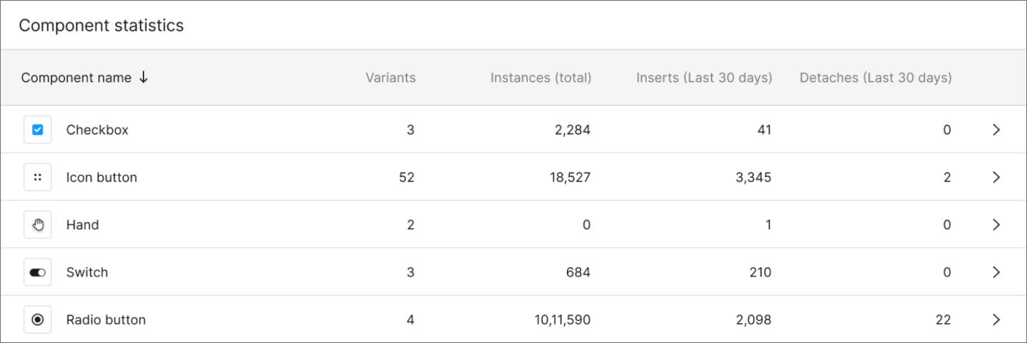
Teams have to choose the design system over building their own version every time. Every time a designer rebuilds a component locally, it signals that the system didn’t have what they needed. String together enough of these instances, and you end up with a library nobody uses.
Adoption usually comes down to a few things:
Watch for the signals that adoption is slipping. Rising detachment rates and duplicate local components both point to patterns the system isn’t covering. When designers detach a component just to swap an icon, slots let them make that swap without detaching.
Design systems for enterprise require more than a well-stocked component library. You have to decide who owns changes and document why components work the way they do. Then keep watching to see whether teams reach for the system at all, because a library nobody opens costs the same to maintain as one that everyone uses.
Every part of that work has a home in Figma. Here’s where to start:
Build and publish the shared libraries your teams design from in Figma Design.
Explore 12 inspiring design system examples from top companies and the Figma Community. See how teams build consistency, scale, and collaborate effectively.

Avoid common design system scaling mistakes. Learn how to transition from a static library to a product infrastructure that aligns design and code at scale.

Design tokens are the shared language your team needs to scale. Learn how to build a resilient hierarchy in Figma and bridge the gap between design and code.


Design operations help teams scale without losing quality or speed. Learn what DesignOps is, who does it, and when your team needs it.

Button states are the visual signals that tell users what a button is doing. Learn the 9 core states, how they work in CSS, and how to build them in Figma.

Learn how to build Claude Skills that keep AI agents on your design system rails, with components, tokens, and naming conventions all in one SKILL.md file.
Build faster with Figma's agent