

UX validation: How to stress-test your designs early
Learn how UX validation helps you spot logic gaps and refine interaction patterns before dev. Use Figma Make to ship dev-ready designs with confidence.
Skip to main content
Strategic planning

A shopper fills up a cart and gets all the way to checkout before a fee buried in the fine print at the bottom of the page bumps up their total. They bail without completing their purchase.
It happens more than most stores would guess. And yet, businesses treat checkout design like a finishing touch, something to fix once they’ve settled the bigger calls on pricing and product.
We surveyed 1,044 US online shoppers to see how often bad design actually costs a sale, and what happens next.
We then focused our analysis on 883 of them, everyday online shoppers who don’t work in website design or product roles, since those professionals tend to answer these questions differently than everyday customers do.
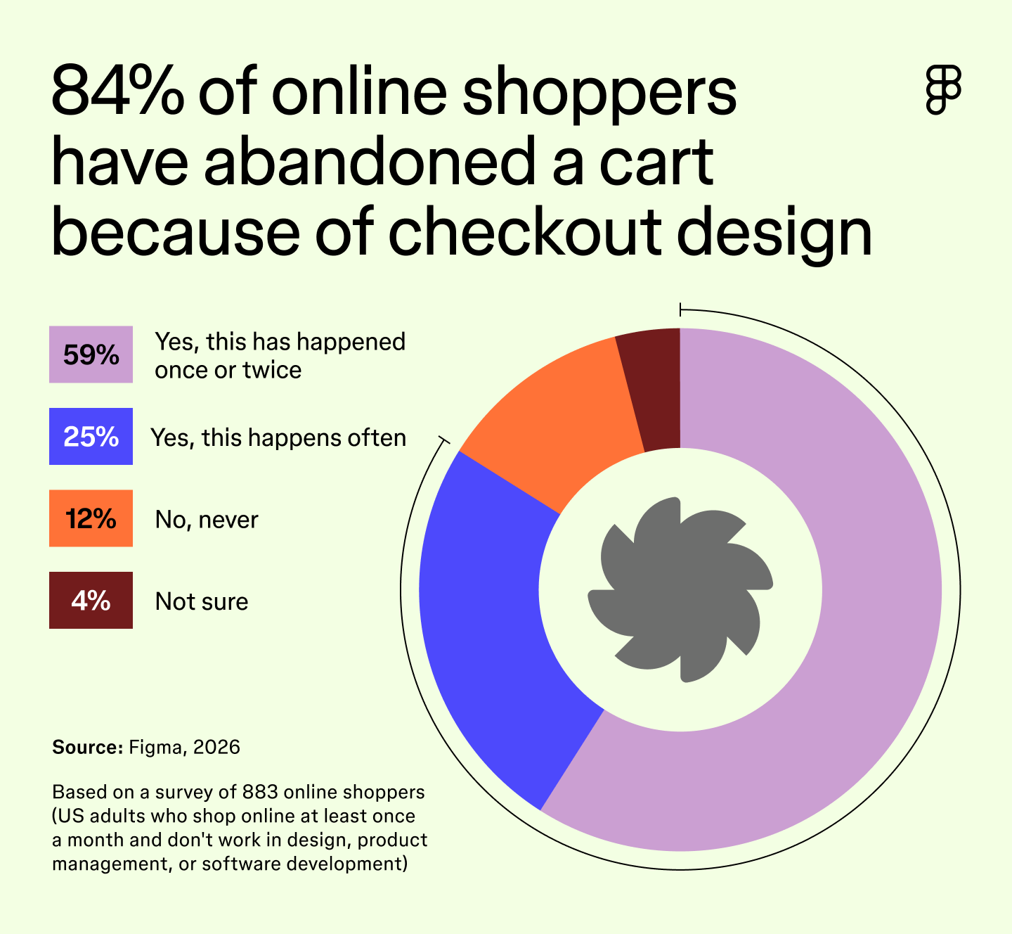
Among that group, 84% have abandoned a cart because of the checkout design. This study walks through exactly where that breakdown happens.
Read on to learn:
Filling a cart doesn’t guarantee a sale. Every extra step between that cart and checkout gives a shopper one more chance to back out.
Countdown timers and low-stock warnings, usually flashing in colors like red or orange to heighten the sense of urgency, are common ways stores try to speed up a decision. The thinking is that urgency pushes a shopper to buy before they can talk themselves out of it.
But only 18% of everyday online shoppers say a countdown timer makes them buy faster. It backfires almost three times as often as it works. Instead, 33% say a timer makes a site feel suspicious, and 23% say it makes them leave the page or abandon their cart outright.
Shoppers can tell when a site or app is trying to rush them, and that recognition usually costs the sale instead of closing it.
Extra fees that appear at checkout and pop-ups that take over the screen tie as the top frustrations when shopping online, each named by 38% of everyday online shoppers. Both hit at the same bad moment: right when a shopper is closest to buying and should feel the most confident finishing the job.
But leaving isn’t limited to checkout. 80% of shoppers, 710 of the 883 people we surveyed, have left a website or app before finishing what they came to do, whether that means abandoning a purchase partway through or bailing on a signup before it’s done.
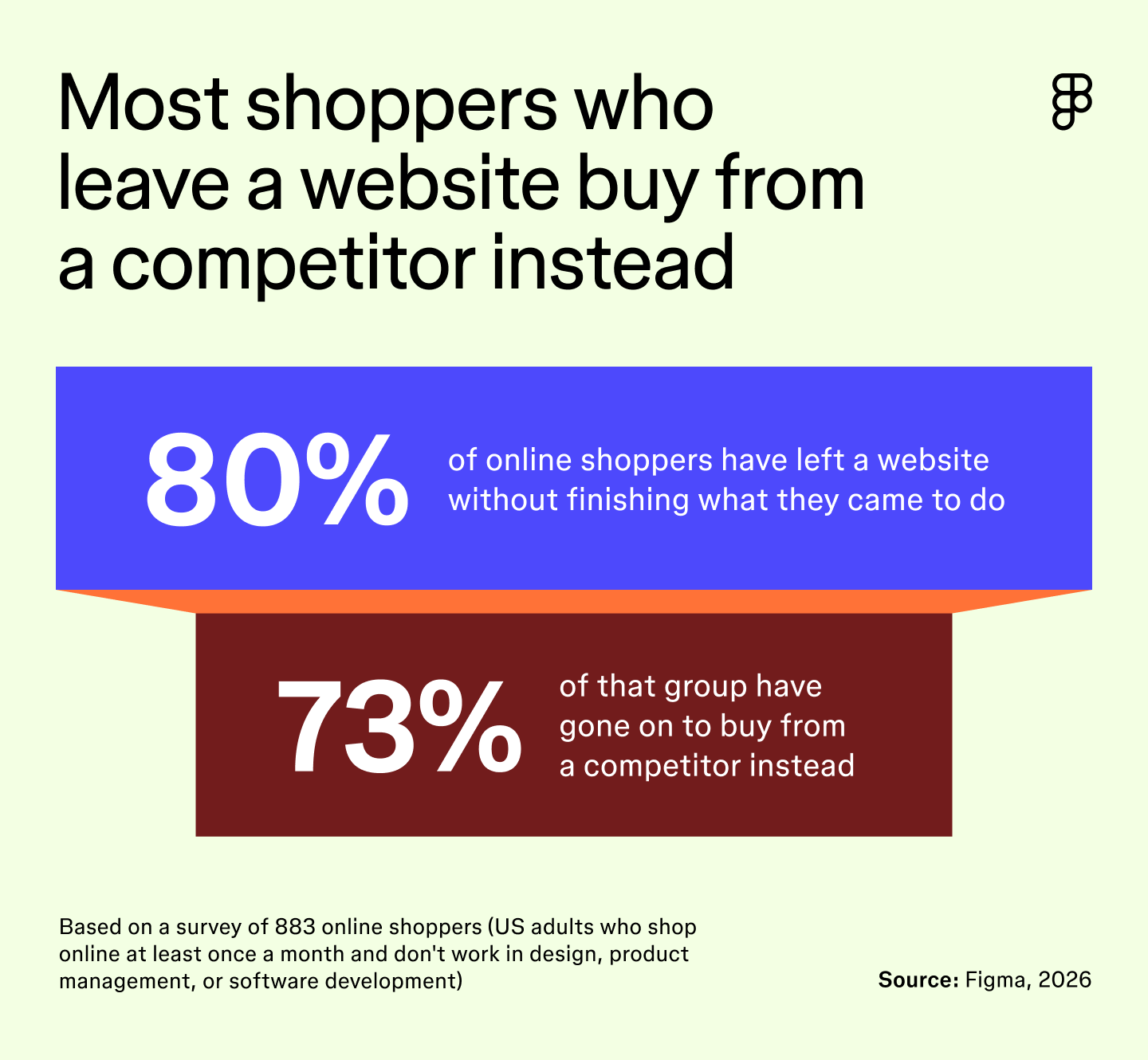
That same group of 710 shoppers has run into trouble in other areas. 89% have also abandoned a cart due to other checkout design issues, such as an excess of form fields, unclear pricing, or too many steps.
Of those 710 shoppers, 73% went on to buy from a competitor instead.
Shoppers today can find another store in just a few taps, and most of them do instead of coming back. That turns one business’s design problem into someone else’s sale.
Trust breaks down fast when a site or app doesn’t look or feel right. 73% of everyday online shoppers say that design significantly or moderately affects how much they trust a brand. This figure rises to 94% when we include shoppers who say it affects trust even slightly. About one in four (26%) say the effect of design on their trust is significant.
That judgment can happen in seconds in response to a single detail, long before a shopper reads a word of copy. But copy adds its own layer of scrutiny once a shopper starts reading it. 66% of everyday shoppers say spelling or grammar mistakes make them question whether a site or app is safe to buy from.
65% say the same about a missing contact page, return policy, or business address. Neither one is technically a security flaw, but shoppers read them as one just the same. A contact page matters more than it might seem, and it’s an easy detail to skip when everything else on a site feels finished.
Getting routed to an AI chatbot instead of a person also leaves some shoppers uneasy. 36% of everyday shoppers say it makes them question whether a site or app is safe to buy from.
The risk of bad design isn’t just losing one customer. It can stop others from even considering a brand or website. Four out of five (80%) everyday online shoppers say they’re likely to tell someone else about a bad experience with a site or app, whether through a review, social media, or word of mouth.
Most of these issues likely trace back to the same starting point, when a site or app was first built. A rushed launch could be why a countdown timer ends up feeling pushy, a checkout page hides a fee, or a cancel button ends up buried in a menu nobody got around to testing.
That’s partly why more businesses are turning to AI—to help build a site or app quickly while better scrutinizing these details along the way.
Our survey makes one thing clear: Bad checkout design costs sales, and a bad experience anywhere on a site or app costs a business a shopper’s trust. Many shoppers won’t tell you they’ve encountered a problem. They’ll just buy from someone else instead. That means a business rarely gets a warning, so the only real chance to catch a bad design decision is before it reaches a shopper, while it can still be tested and fixed.
Figma gives design and product teams a shared space to catch these problems before shoppers ever run into them.
Here’s where to start:
Prototype and test your site or app in Figma Design before it ships.
The survey was conducted online by Centiment, with a total sample size of 1,044 U.S.-based adults aged 18 or older who shop online (via websites or apps) at least once a month.
Fieldwork was undertaken from August 6 to August 12, 2026. Data are unweighted, and the margin of error is approximately ±3% for the overall sample at the 95% confidence level.
Throughout this study, “everyday online shoppers,” “everyday shoppers,” and “online shoppers” refer to the group of 883 respondents who reported not working in UI/UX, visual design, product management, or software development. We looked at this group on its own because their answers often differed from those of design and development professionals. The margin of error for this group remained approximately ±3 % at the 95% confidence level.
Learn how UX validation helps you spot logic gaps and refine interaction patterns before dev. Use Figma Make to ship dev-ready designs with confidence.


Explore 7 AI for A/B testing tools to shorten your feedback loops. Learn how to integrate AI into your testing workflow and ship validated designs faster.


Learn best practices for pricing pages and explore design examples to create a page that informs your potential customers and boosts conversions.

Compare 11 no-code website builders with AI support and drag-and-drop features. Find out how Figma Make and others help you effortlessly build websites.

Button states are the visual signals that tell users what a button is doing. Learn the 9 core states, how they work in CSS, and how to build them in Figma.


Learn how AI usability testing can speed up your research and uncover deeper user insights. Explore a modern workflow and 7 tools for UX teams to try.