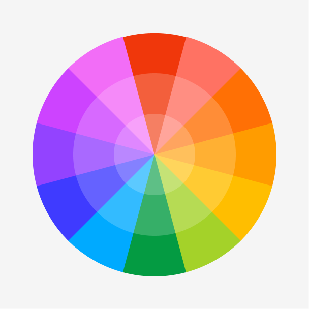
Figma color wheel
Want to find the perfect complementary or analogous colors to match powder blue?
Skip to main content
Everything you need to know about powder blue to inspire your next design.
Powder blue is a light and airy shade located in the blue-green region of the color wheel. It promotes relaxing and calming feelings and evokes a sense of cleanliness and freshness, similar to a clear morning sky.


Shades
Tints
Tones
Hues
Complementary
Split
Monochromatic
Analogous
Triadic
Square
Winter Chill
Farmhouse Chic
Zephyr
Powder blue is defined by the following color codes and values to ensure consistency across various digital platforms and devices.
- HEX code: #B8E3E9
- RGB value: 72.2% red, 89% green, and 91.4% blue
Accessibility considerations play a crucial role in UX and UI design color choices. Figma offers plugins in the Community to make sure your designs meet Web Content Accessibility Guidelines.
Here are some ways to use powder blue in your designs:
Keep in mind that color and its meaning can change from culture to culture—and at any given time. If you are designing for a global audience, research color considerations for your specific regions.
For variations within the same soft spectrum as powder blue, consider:
To complement powder blue, consider pairing it with:
Other colors worth considering include charcoal to add a sense of sophistication, mint green for a refreshing color palette, or lavender to enhance powder blue’s calming nature.
While powder blue is tranquil, it may clash with:
Powder blue symbolizes serenity, peace, and tranquility. Its soft, pastel-like hue also connotes purity and innocence, while its light and airy appeal is associated with freshness and cleanliness.
In color psychology, powder blue promotes feelings of relaxation, creating a calm and inviting atmosphere. Due to its serene nature, it also evokes a sense of trust and reliability du to its serene nature.
In UI design, powder blue is useful for wellness and health apps that want to promote a calming and trustworthy environment.
Powder blue was originally created from smalt, a deep blue glass ground into powder, often used to create a wide range of blue pigments, including lighter shades like powder blue. In 1894, the color name “powder blue” was used to describe the pale blue hue derived from smalt.
Powder blue gained popularity in the 1970s and became a favored color worn by sports teams. The Minnesota Twins wore a powder blue uniform from 1973 to 1986, while the Texas Rangers introduced a powder blue uniform in 1977. The Los Angeles Chargers returned their iconic powder blue uniforms in 2019 and still use them as their primary color for home games.
Whether used in interior design to create a soothing environment, in spring and summer fashion, or in branding and design to evoke feelings of trust and reliability, powder blue’s versatility is still used in many contexts today.
Contrast 1.38
#B8E3E9
How you design, align, and build matters. Do it together with Figma.
| Category | ||
|---|---|---|
Fail | Fail | |
Fail | Fail | |
Fail | Fail |
Contrast 15.2
#B8E3E9
How you design, align, and build matters. Do it together with Figma.
| Category | ||
|---|---|---|
Pass | Pass | |
Pass | Pass | |
Pass | Pass |
Protanopia
Deuteranopia
Tritanopia
Achromatopsia
The hexadecimal color #B8E3E9, known as powder blue, has RGB values of R:184, G:227, B:233 and CMYK values of C:0.21, M:0.03, Y:0, K:0.09.
| VALUE | CSS | |
|---|---|---|
| HEX | B8E3E9 | #B8E3E9 |
| RGB DECIMAL | 184, 227, 233 | RBG(184,227,233) |
| RGB PERCENTAGE | 72.2, 89, 91.4 | RGB(72.2%,89%,91.4%) |
| CMYK | 21, 3, 0, 9 | |
| HSL | 187.3°, 52.7, 81.8 | HSL(187.3°,52.7%,81.8%) |
| HSV (OR HSB) | 187.3°, 21, 91.4 | |
| WEB SAFE | CCCCFF | #CCCCFF |
| CIE-LAB | 87.49, -12.583, -7.533 | |
| XYZ | 61.941, 71.01, 87.529 | |
| xyY | 0.281, 0.322, 71.01 | |
| CIE-LCH | 87.49, 14.665, 210.906 | |
| CIE-LUV | 87.49, -22.237, -9.614 | |
| HUNTER-LAB | 84.267, -16.261, -2.598 | |
| BINARY | 10111000, 11100011, 11101001 | |
| iOS - SwiftUI | Color(red: 0.722, green: 0.89, blue: 0.914) | |
| iOS - UIKit | UIColor(red: 0.722, green: 0.89, blue: 0.914, alpha: 1) | |
| Android - Compose | Color(0xFFB8E3E9) |
Want to find the perfect complementary or analogous colors to match powder blue?
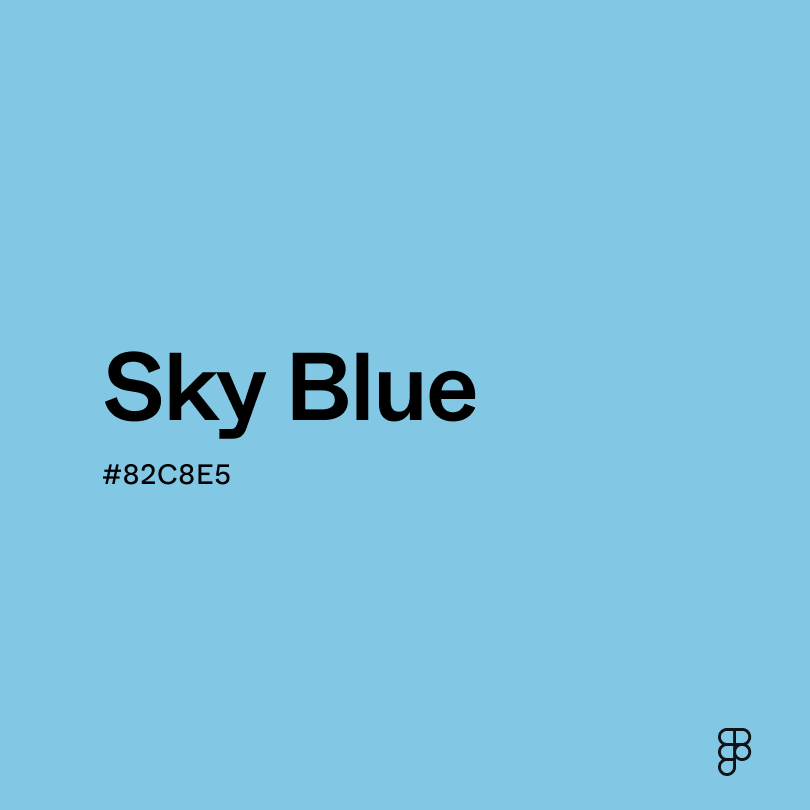
Discover the calming nature of sky blue.

Embrace the gentle calm of misty blue.