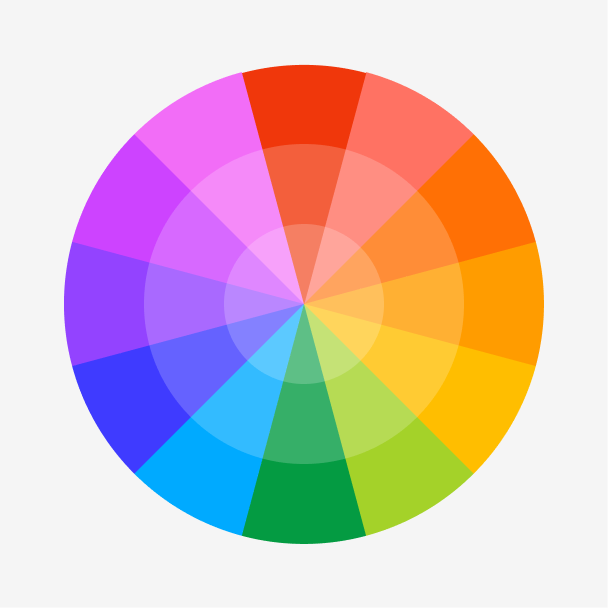
Figma color wheel
Want to find the perfect complementary or analogous colors to match apricot?
Skip to main content
Everything you need to know about apricot to inspire your next design.
Apricot is situated between orange and yellow on the color wheel, resembling the shade of the ripe fruit. Its yellow influence brings a touch of optimism and cheerfulness, while its orange hue lends a subtle warm energy.


Shades
Tints
Tones
Hues
Complementary
Split
Monochromatic
Analogous
Triadic
Square
Hazelnut Latte
Morning Pasture
Sunset Cruise
Apricot is defined by the following color codes and values to ensure consistency across various digital platforms and devices.
Accessibility considerations play a crucial role in UX and UI design color choices. Figma offers plugins in the Community to make sure your designs meet Web Content Accessibility Guidelines.
Here are some ways to use apricot in your designs:
Keep in mind that color and its meaning can change from culture to culture—and at any given time. If you are designing for a global audience, research color considerations for your specific regions.
For variations within the same warm spectrum as apricot, consider:
To complement apricot, consider pairing it with:
Other colors worth considering include brown to add to apricot’s warmth, lavender for a soft and whimsical combination, or white for a fresh and airy vibe.
While apricot is soft, it may clash with:
Apricot symbolizes optimism, energy, and happiness. Linked to the fruit, it also suggests sweetness, freshness, and vitality.
In color psychology, apricot’s warm and inviting qualities stimulate feelings of hope and excitement. Its playful energy creates a sense of youthfulness and creativity.
In UI design, apricot creates a friendly and welcoming atmosphere. Use it as a dominant color to bring energy and playfulness to user interfaces or as an accent shade to add a soft and subtle infusion of warmth.
The word “apricot” made its way into the English language during the 16th century, derived from the Arabic word “al-birquq.” Apricot was first recorded as a color name to describe the shade of the fruit in 1851 during the rise of synthetic dyes. In 1998, Crayola included apricot as a permanent color in its range of orange crayons.
Today, apricot is a popular choice in fashion, interior design, and UI design to convey warmth and add a bit of playfulness. It’s also a popular seasonal color, used to evoke the freshness of spring and summer and the warm energy of fall.
Contrast 1.76
#FFB27F
How you design, align, and build matters. Do it together with Figma.
| Category | ||
|---|---|---|
Fail | Fail | |
Fail | Fail | |
Fail | Fail |
Contrast 11.93
#FFB27F
How you design, align, and build matters. Do it together with Figma.
| Category | ||
|---|---|---|
Pass | Pass | |
Pass | Pass | |
Pass | Pass |
Protanopia
Deuteranopia
Tritanopia
Achromatopsia
The hexadecimal color #FFB27F, known as apricot, has RGB values of R:255, G:178, B:127 and CMYK values of C:0, M:0.3, Y:0.5, K:0.
| VALUE | CSS | |
|---|---|---|
| HEX | FFB27F | #FFB27F |
| RGB DECIMAL | 255, 178, 127 | RGB(255,178,127) |
| RGB PERCENTAGE | 100, 69.8, 49.8 | RGB(100%,69.8%,49.8%) |
| CMYK | 0, 30, 50, 0 | |
| HSL | 23.9°, 100, 74.9 | HSL(23.9°,100%,74.9%) |
| HSV (OR HSB) | 23.9°, 50.2, 100 | |
| WEB SAFE | FF9966 | #FF9966 |
| CIE-LAB | 78.831, 22.512, 37.217 | |
| XYZ | 60.992, 54.637, 27.411 | |
| xyY | 0.426, 0.382, 54.637 | |
| CIE-LCH | 78.831, 43.496, 58.831 | |
| CIE-LUV | 78.831, 56.939, 43.458 | |
| HUNTER-LAB | 73.917, 17.935, 29.755 | |
| BINARY | 11111111, 10110010, 0111111 | |
| iOS - SwiftUI | Color(red: 1, green: 0.698, blue: 0.498) | |
| iOS - UIKit | UIColor(red: 1, green: 0.698, blue: 0.498, alpha: 1) | |
| Android - Compose | Color(0xFFFFB27F) |
Want to find the perfect complementary or analogous colors to match apricot?
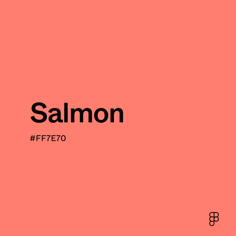
Explore the playful energy of salmon.

Experience the vibrant color of tangerine.